

THE BRAND IDENTITY FOR
Willow House
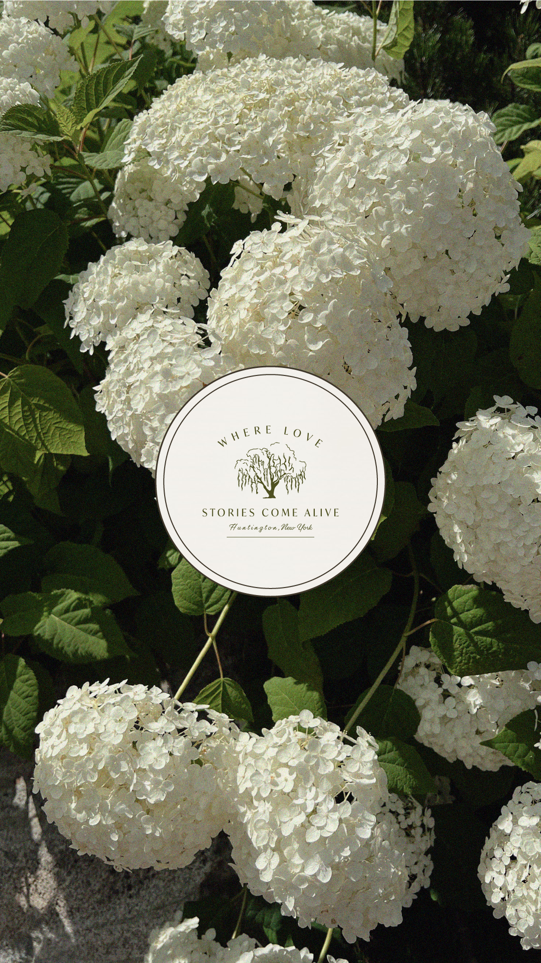
Remember those childhood games where you’d ask each other all your favorite things - color, food, song? There’s one question I’ve always loved to ask, even as an adult: What’s your favorite tree? It usually catches people off guard, but for me, the answer has always been easy, the willow.
There’s something deeply emotional about a willow tree. The way its branches sway gently in the wind, offering both shelter and movement, feels like nature’s own embrace. To me, willows have always belonged in stories, quietly magical, almost otherworldly. As someone drawn to all things enchanting and ethereal, I’ve always held a special affection for their elegance and grace.
When I dreamed up the idea for a wedding venue, I imagined a space where couples could begin their next chapter beneath something truly symbolic. The image came to me almost instantly: a sweeping willow tree as the ceremony centerpiece, romantic, grounding, and full of soul. A place where vows are exchanged under dancing branches, and love stories begin in the most magical way. And just like that, The Willow House came to life.
THE INSPIRATION

THE DESIGN PROCESS
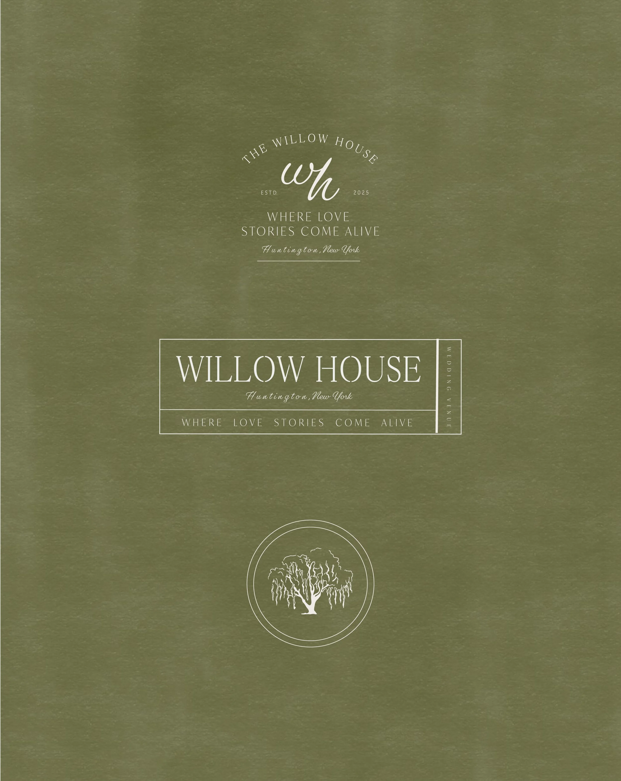
Because The Willow House began as a passion project, it was important that the brand felt rooted in intention from the very start. I began with a story, one that could live within the visual identity and emotionally connect to the original inspiration. The concept emerged as an imagined history: a once-grand estate lovingly maintained by a family who cherished time spent in nature and believed in slowing down to savor life’s most meaningful moments. Their gardens weren’t just planted, they were curated. The hedges, statues, fountains, and blooms were all part of a deliberate effort to surround themselves with both natural and crafted beauty.
This philosophy became the foundation for the brand strategy. The visual direction needed to reflect a thoughtful balance between organic life and artistic legacy, the harmony of wild nature and human touch. When creating the mood board, I pulled textures from stone and garden soil, muted tones from weathered statues and willow leaves, and the architectural elegance of the estate itself. Every visual element needed to whisper history, while still feeling relevant to a modern, romantic couple.
Above all, the brand needed to feel alive. A place where stories grow alongside the trees, and where love doesn’t just visit, but takes root. The Willow House is earthy, elegant, and deeply timeless. It honors the past while making space for new beginnings, where every ceremony beneath the willow becomes part of something greater.


