THE BRAND IDENITY FOR
Kintsugi AcresTHE STORY
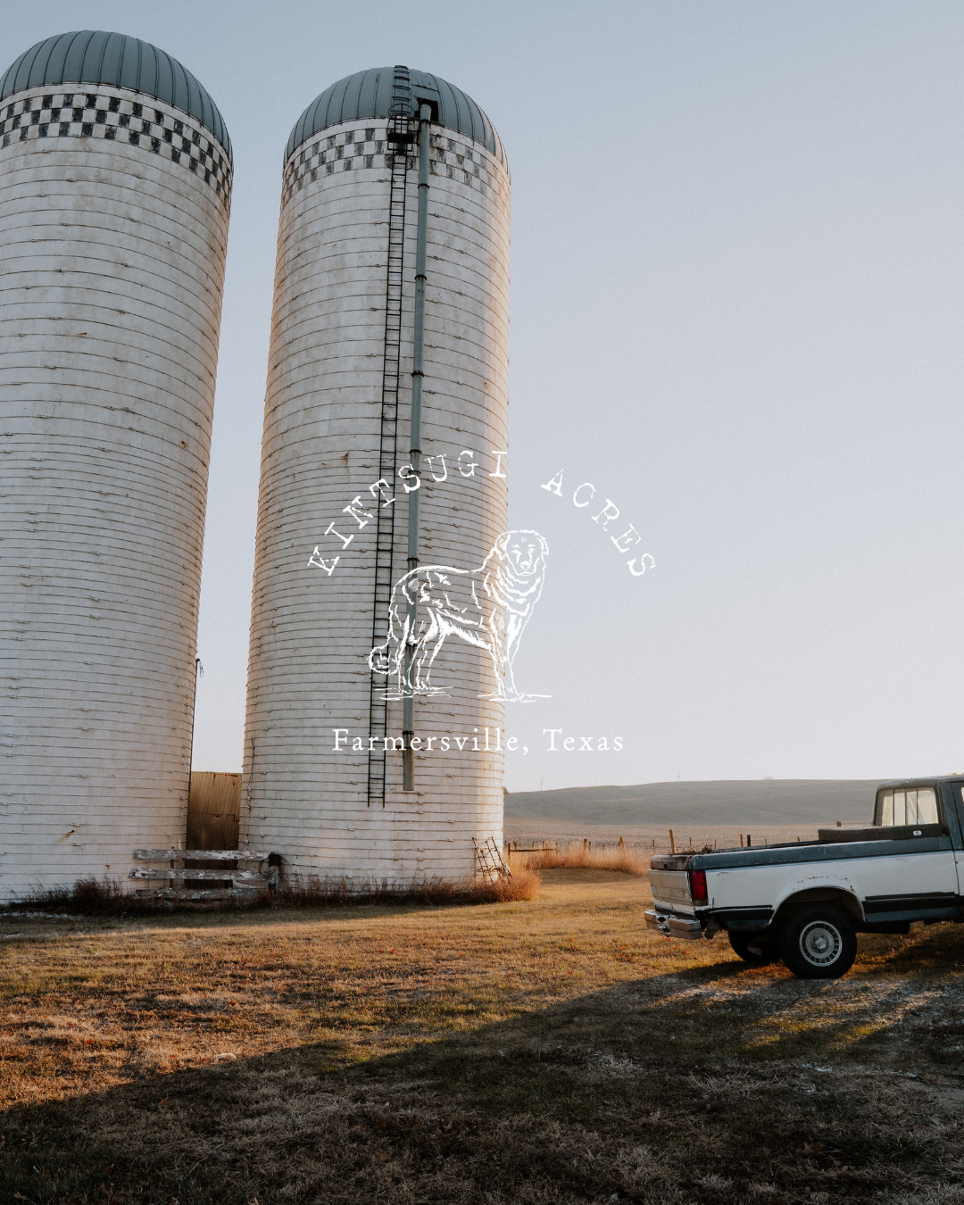
Emily came to me with a vision rooted in restoration. She dreamed of creating a brand identity that captured the soul of her mission, bringing healing, connection, and second chances to her rural community. At the heart of this story is Kintsugi, a big, fluffy white dog with a gentle spirit and wandering paws. Rescued by Emily, Kintsugi quickly became more than a companion; she became a symbol of hope. Her story of resilience reminded Emily that healing is a journey, and that sometimes, all it takes is for someone to believe in you.
Inspired by the bond they shared, Emily felt called to build something bigger. Having spent her life surrounded by horses, wide-open fields, and the quiet rhythms of country living, she knew this was where her purpose could flourish. Kintsugi Acres was born from that calling, a sanctuary of second chances nestled in nature. A place where broken things are mended with care, where hard work and organic living create a life of meaning, and where joy is found in the simplest moments.
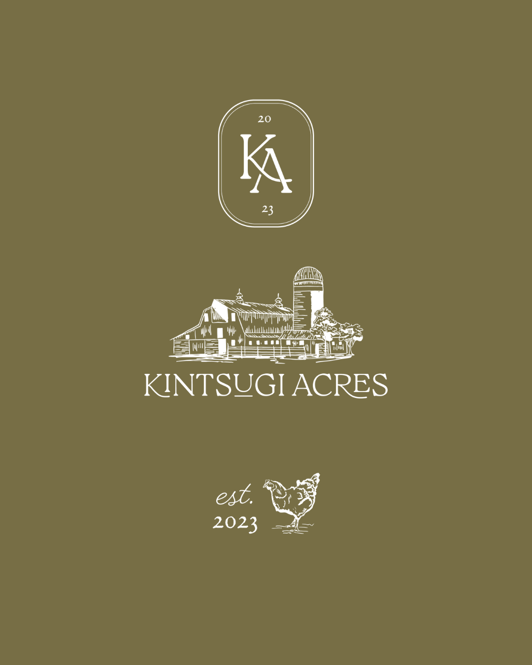
Emily envisioned a brand that felt as heartfelt and earthy as the land itself. She asked for hand-drawn illustrations that told the story visually: a charming barn, goats, chickens, and of course, Kintsugi herself. Naturally, I was thrilled. This was the kind of project where art and story could truly intertwine. From the first pencil sketch of the barn, which met with Emily’s enthusiastic approval, I knew we were on the right path.
The final result was more than a logo suite; it became a visual love letter to everything Kintsugi Acres stands for: resilience, kindness, and the quiet power of believing in second chances. It’s a brand rooted in authenticity, organic, adventurous, and timeless, just like the life Emily is building.


sometimes, all you need is for someone to take a chance on you